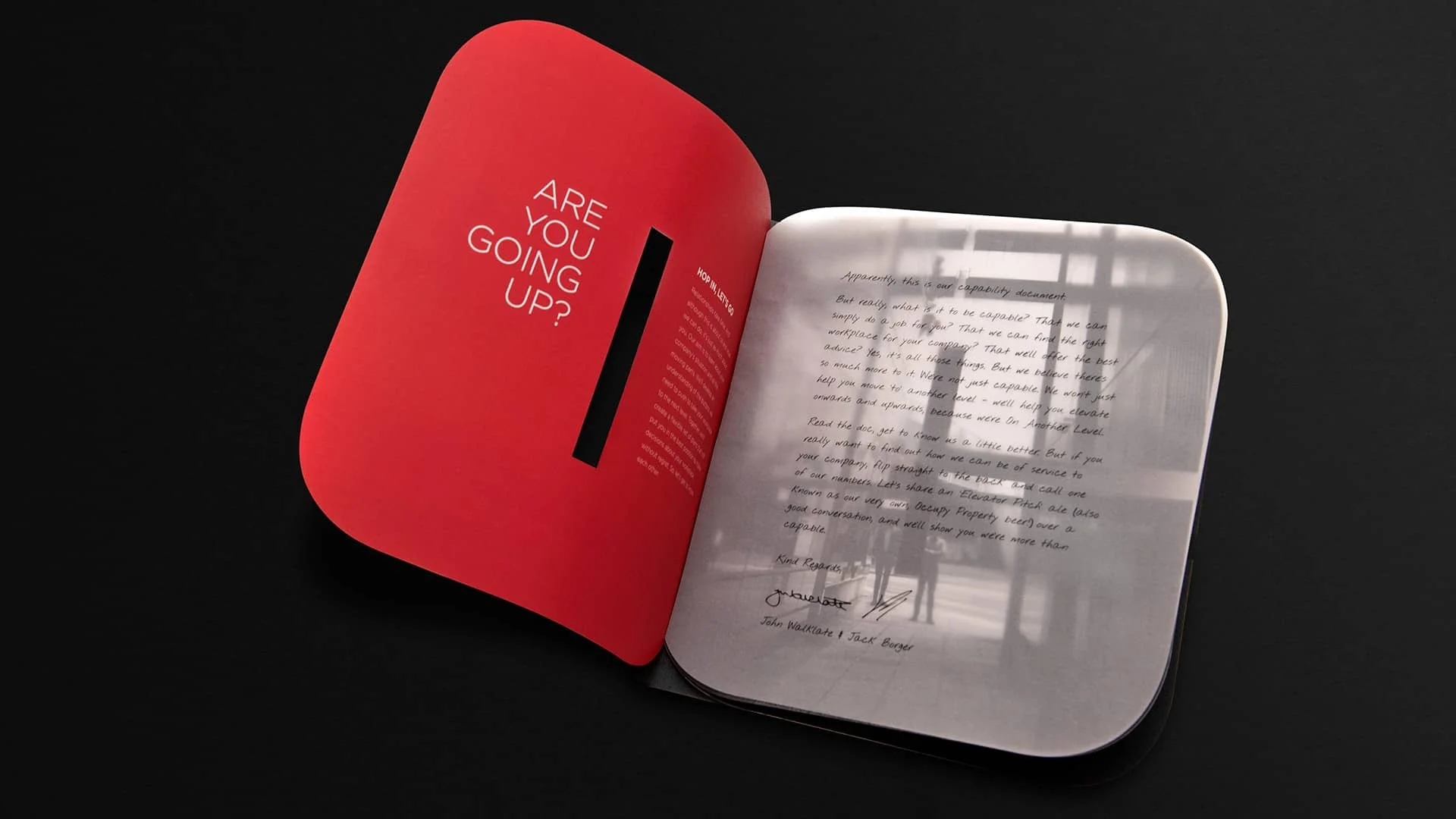
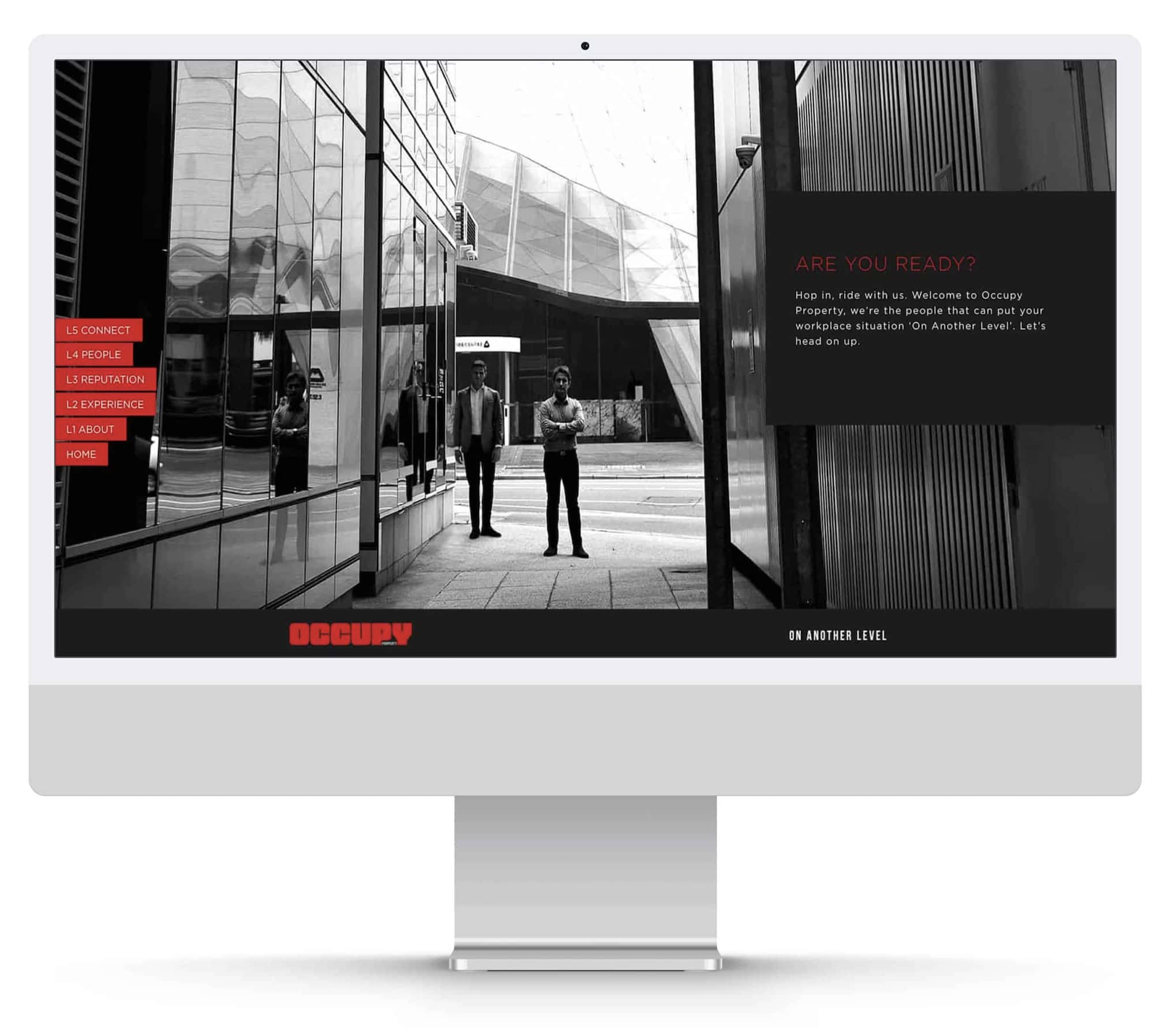
This was one of those times when a partner of a start-up was nervous about the proposed name. And I totally agreed with him. I can’t even remember what it was. But it sounded Latin. I presented a long list and there was one stand out. Occupy. It suited his attitude. Wanting to shake up the commercial office and industrial world, the ‘challenger’ tone of the name felt right. And every piece of collateral lived up to the name. The name occupied both sides of the business cards. The corporate brochure had one page, die-cut, for each letter of the name. And the logo stacked in multiple ways, depicting a row of offices, to a tall tower. They’ve embraced the identity more than most clients ever do.